Standing in front of a small card, unsure what it wants from you? Here is how to read gallery wall text: take the title, date and materials first, then the one idea the short paragraph offers.
This guide is part of a wider set on brooklyn gallery exhibitions.
| Item | Value |
|---|---|
| Suggested length of an individual artwork label | 70-80 words |
| Suggested length of an introductory panel | 100-200 words |
| Average standing read time per label | 10 seconds |
| Suggested label height | 1 m to 150 cm |
| Suggested label type size | 18-24 points |
| Share of exhibition elements the average visitor visits | About a third |
These figures come from the Museums & Galleries NSW labelling guidance and the Australian Museum’s review of text and labels. They are museum guidance, not rules, and they can change, so check the sources before you rely on them.
What a gallery label usually contains
Museums & Galleries NSW lists a basic information structure for labels in its exhibition labelling guidance. It is written for people making labels, but it shows you what to look for on the wall.
- Artist or maker: who made the work.
- Title: what the artist or the gallery calls it.
- Date: when the work was made.
- Medium or materials: what it is made from.
- Dimensions: how big it is.
- Provenance or collection: where the work came from, or who holds it.
- Description: the short text that explains why the work matters here.
The same guidance says to keep the order of information consistent. Once you learn the pattern on one label, the next label in the room should read the same way.
Treat the list as a checklist rather than a promise. A gallery may print fewer lines, and the wall itself will show you which ones it chose.
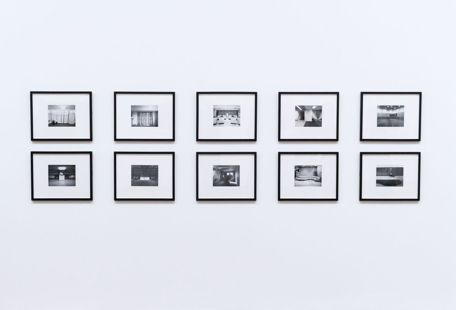
How wall text is layered across a show
Exhibition texts usually include a title panel, an introduction, section texts and object labels, according to the Wellcome Collection’s inclusive exhibition design toolkit. Each layer does a different job, so it helps to read them in order.
The Museums & Galleries NSW guidance describes a label hierarchy for larger shows. It suggests 100-200 words for an introductory panel and 70-80 words for an individual artwork label.
- Introductory panel: the overall idea of the show.
- Room or section labels: the theme that groups the works nearby.
- Artwork labels: the facts and the short description for one piece.
The Australian Museum’s guidance says “Every exhibition must have a big idea: a sentence or statement of what the exhibition is about”. Look for that sentence on the first panel, then test each later label against it.
The layers matter most when several artists share a space. The guide on group show vs solo show explains how the two formats differ, and the intro panel is where you find out how the works connect.
A routine for reading one label
You do not need a special skill, only an order. This routine follows the structure above and works on any label.
- Read the identification lines first: artist, title, date and materials.
- Look at the work itself before you read the paragraph, so the text answers a question you already have.
- Read the description for its main claim, which is the single thing the writer wants you to notice.
- Check the provenance or collection line if there is one, to see where the work sits in a larger story.
- Mark any word you do not know and move on; look it up after the visit.
Writers are told to explain technical terms and avoid jargon, according to Gaylord’s label-writing tips. If a term is left unexplained, treat it as a prompt to look it up later rather than a sign that you missed something.
Why are gallery labels so short?
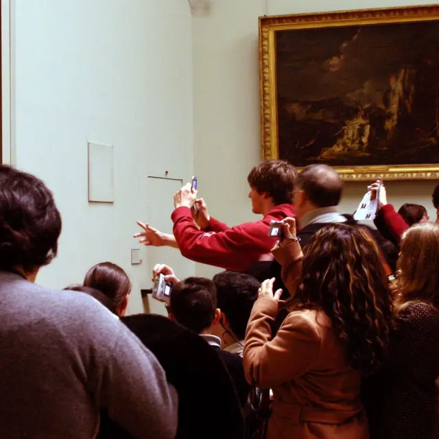
Because most people give each one very little time. Museums & Galleries NSW puts the average standing read time at 10 seconds per label, while the BC Museums Association cites two seconds for any piece of text. The sources differ, so treat both as rough averages.
Across whole exhibitions, the Australian Museum’s review reports that visitors skip many elements, visiting on average only a third of them. It also says visitors usually spend less than twenty minutes, and that long panels packed with information are skipped by a majority of visitors, except those with a deep interest in the subject.
The BC Museums Association notes that visitors tend to read mostly in the first 30 minutes of a visit and are selective after that. If a show matters to you, read the labels you care about early.
The same source says the most-read texts are about things, and the least-read are about ideas. An idea-heavy label may therefore deserve a slower second look.
Short does not mean simple-minded. The National Museum of Ireland’s label guidelines name a general audience of 12 years of age as the ideal target, which helps explain why labels use plain wording.
When the artist is new to you, as with many names covered in emerging artists brooklyn, the label is a good place to start. Read the identification lines and the description before you move on.
Where labels sit and what to do when you want more
Labels are meant to sit close to the work they describe. Museums & Galleries NSW suggests placing them between 150 cm and 1 m from the floor, while the Wellcome Collection puts the top line of wall-mounted object labels between 1000 mm and 1350 mm.
The Museums & Galleries NSW guidance also says labels should be on the side of the artwork that visitors approach first. It adds that research suggests audiences will turn left unless directed otherwise, so look to the left of a work first.
It recommends type between 18-24 points and a matt finish to avoid glare. If a label is hard to read, that is a design problem, not a failing on your part.
For more depth, look for a QR code near the label. The guidance says such prompts may help connect the exhibition to online content, but they should not take precedence over other standard forms of label information.
The Wellcome Collection notes that research has shown many visitors wish to access exhibition texts online, before or after a visit. The Museums & Galleries NSW guidance also recommends large print text on portable information sheets for elderly, visually impaired or less mobile audiences, so it is reasonable to ask a venue whether one exists.
Frequently asked questions
How long should I spend on each label?
Show answer
There is no rule. Museums & Galleries NSW gives 10 seconds as the average standing read time, so a label written to that length can be read in about that time. Take longer when a work holds your attention.
Do all galleries follow these guidelines?
Show answer
No. The sources here are guidance from museums and advisory bodies, written for the people who make labels. A given gallery may print more, fewer or different lines, so use the guidance as a reading aid, not a rulebook.
What does the provenance or collection line tell me?
Show answer
The Museums & Galleries NSW structure lists “Provenance or collection” as one field. It points to where the work came from or which collection holds it.
Can I read the wall text online?
Show answer
Sometimes. The Wellcome Collection says research has shown many visitors wish to access exhibition texts online. Check the venue’s own website to see whether it offers them.